Level SuperMind
Design System
A unified language for building consistent, scalable, and delightful experiences across the Level SuperMind app — from meditation and sleep to astrology and community.
This system provides the building blocks — tokens, typography, color, spacing, and components — so every designer and developer builds from the same foundation.
Colors
The color system supports both dark and light themes. Lighter shades are added to the existing palette; yellow, green, and purple remain the same across themes.
surface-4-dark is used as the background color. For text, use surface-4-light in dark theme.Typography
The type system uses Suisse Int'l across all styles. Each style is purpose-built — use Display only for special cases, Title Screen only once per screen.
Spacing
Foundational tokens set the raw sizes. Semantic tokens apply them in context — so you always know what spacing to use, and where.
| Name | Value |
|---|---|
| size-10 | 10px |
| size-12 | 12px |
| size-20 | 20px |
| size-40 | 40px |
| size-60 | 60px |
| Name | Token | Value |
|---|---|---|
| cards-between-large | size-40 | 40px |
| cards-between-small | size-20 | 20px |
| chips-between | size-10 | 10px |
| component-default | size-20 | 20px |
| Name | Token | Value |
|---|---|---|
| between-section-large | size-60 | 60px |
| between-section-small | size-40 | 40px |
| between-text | size-20 | 20px |
| between-options | size-12 | 12px |
| component-default | size-20 | 20px |
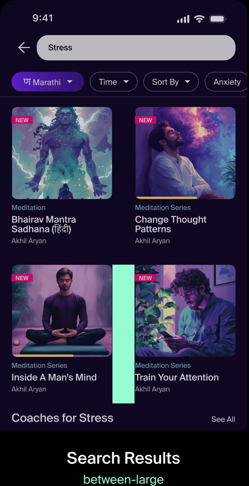
Cards in a 2-column search results grid use between-large (size-40, 40px) for the vertical gap between rows of content.
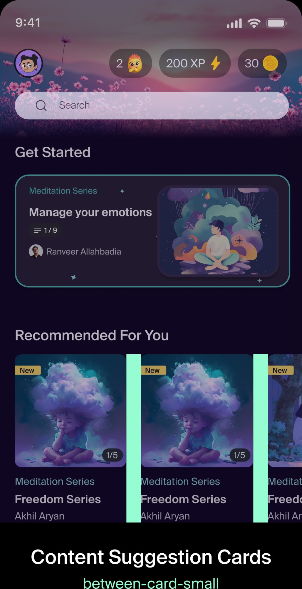
Horizontally scrolling content suggestion cards use between-card-small (size-20, 20px) for the gap between each card.
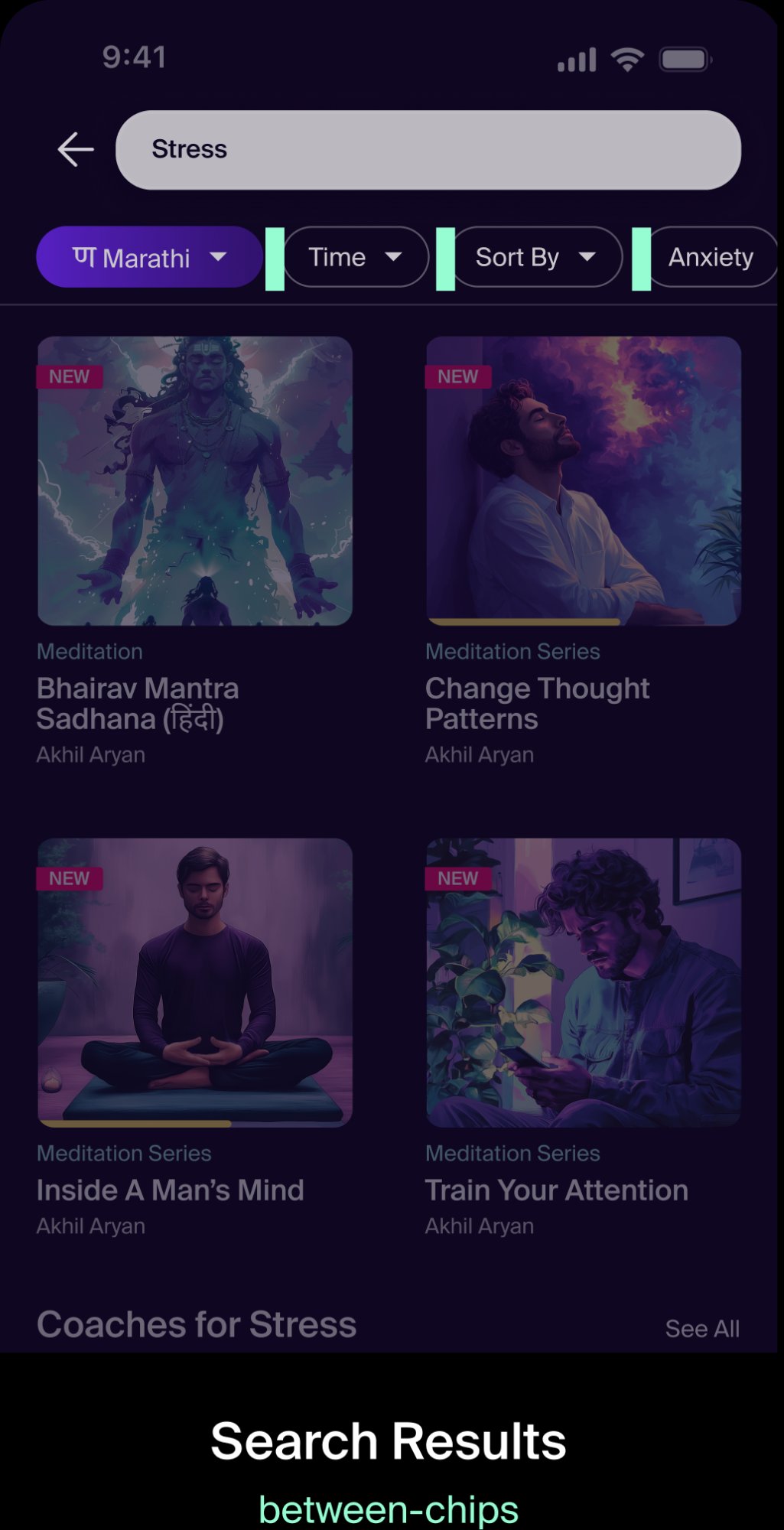
Filter chips placed horizontally next to one another use chips-between (size-10, 10px). Chips scroll off screen when there are more than fit.
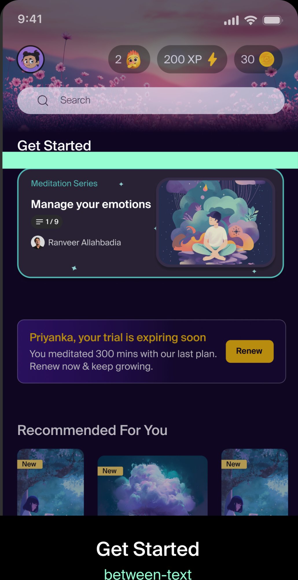
The gap between a section title (e.g. "Get Started") and the content block below it uses between-text (size-20, 20px). Built into text styles — add manually when text blocks aren't in the same frame.
Tokens
Semantic tokens map meaningful names to foundational values. Use semantic tokens in your work — not foundational tokens or hard-coded values.
gap: 40px; // ❌ hard-coded — never
| Semantic Token | Foundation | Resolved | Axis |
|---|---|---|---|
| screen-mobile | size-20 | 20px | horizontal |
| section-large | size-60 | 60px | vertical |
| between-section-large | size-60 | 60px | horizontal |
| between-section-small | size-40 | 40px | horizontal |
| cards-between-large | size-40 | 40px | vertical |
| cards-between-small | size-20 | 20px | vertical |
| between-text | size-20 | 20px | horizontal |
| between-options | size-12 | 12px | horizontal |
| chips-between | size-10 | 10px | vertical |
| component-default | size-20 | 20px | both |
Buttons
A button lets the user perform an action with a tap or click. Priorities set a visual hierarchy — help important buttons take precedence over others.
| Size | Height | Font Size | Font Weight |
|---|---|---|---|
| Large | 48px | 16px | Semibold |
| Medium | 40px | 14px | Semibold |
| Small | 34px | 12px | Semibold |

Use one primary button per page to indicate the most important action.
Don't use multiple primary buttons on a single page — it removes hierarchy.
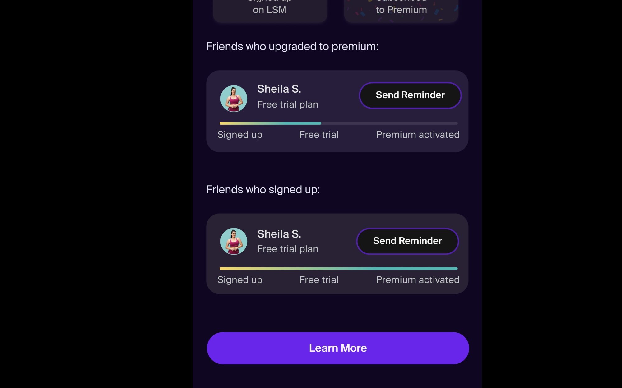
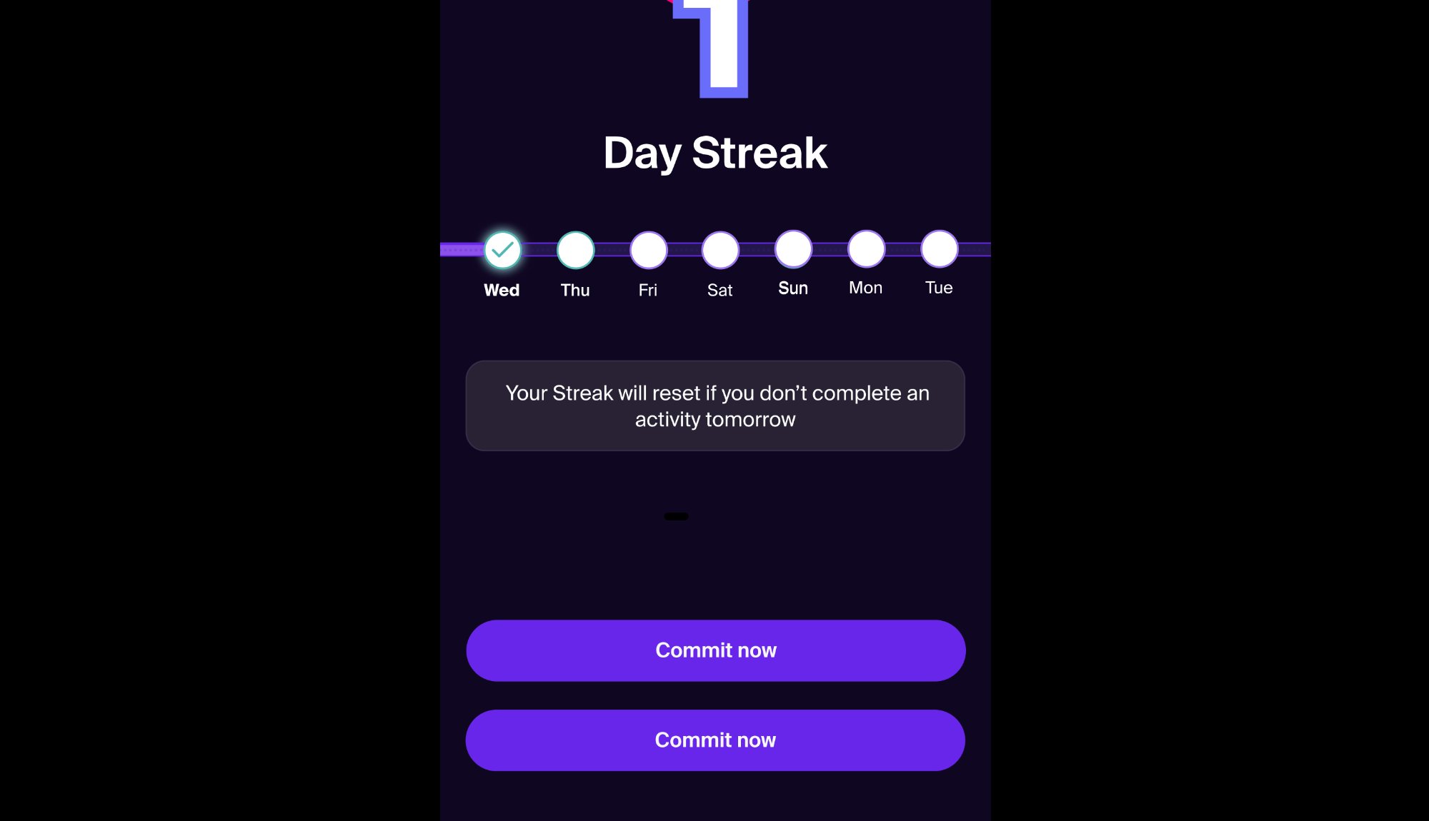
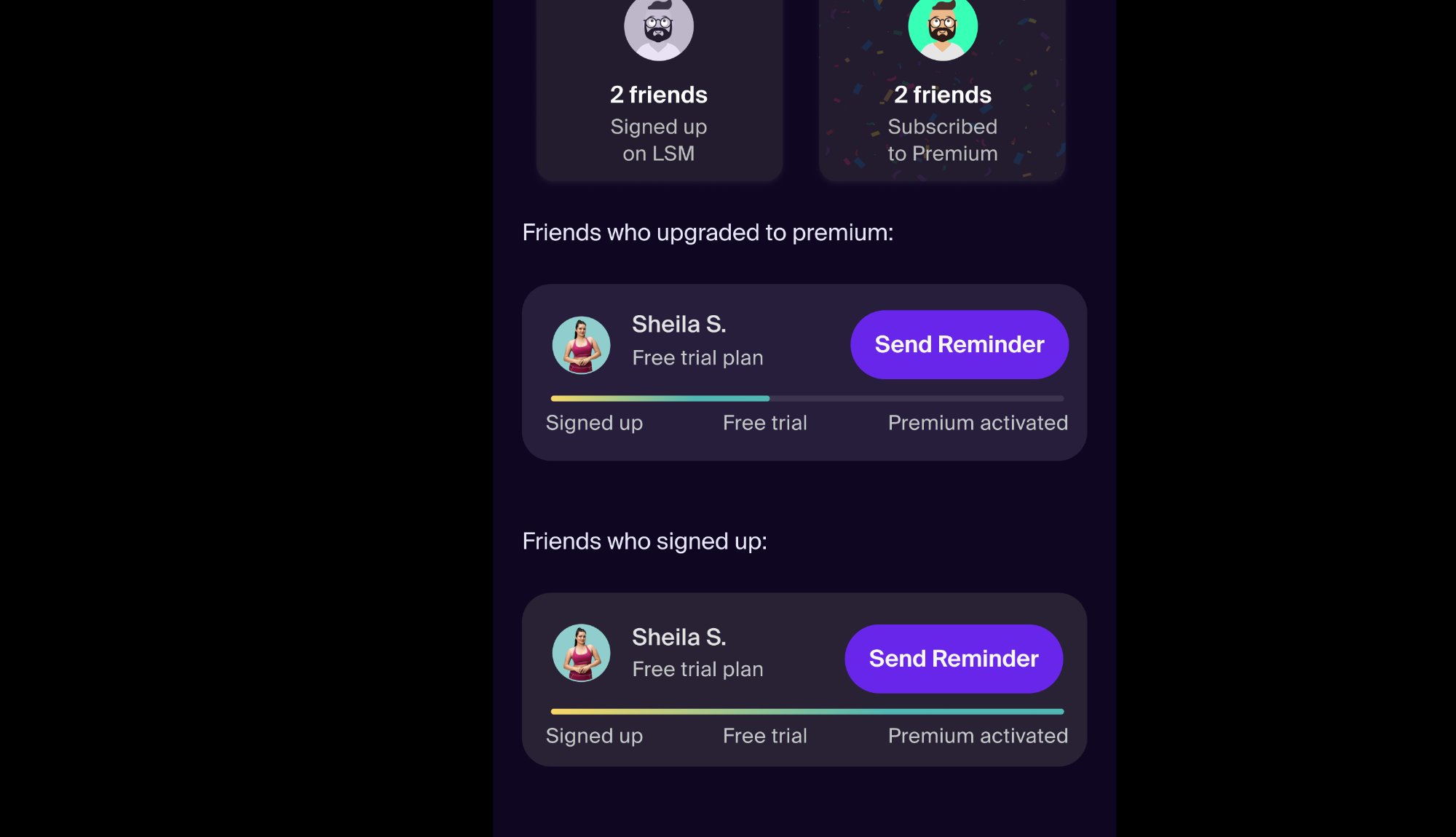
Use secondary buttons when you need to display multiple key actions at the same level of hierarchy — like "Send Reminder" inline in each card alongside a primary CTA below.
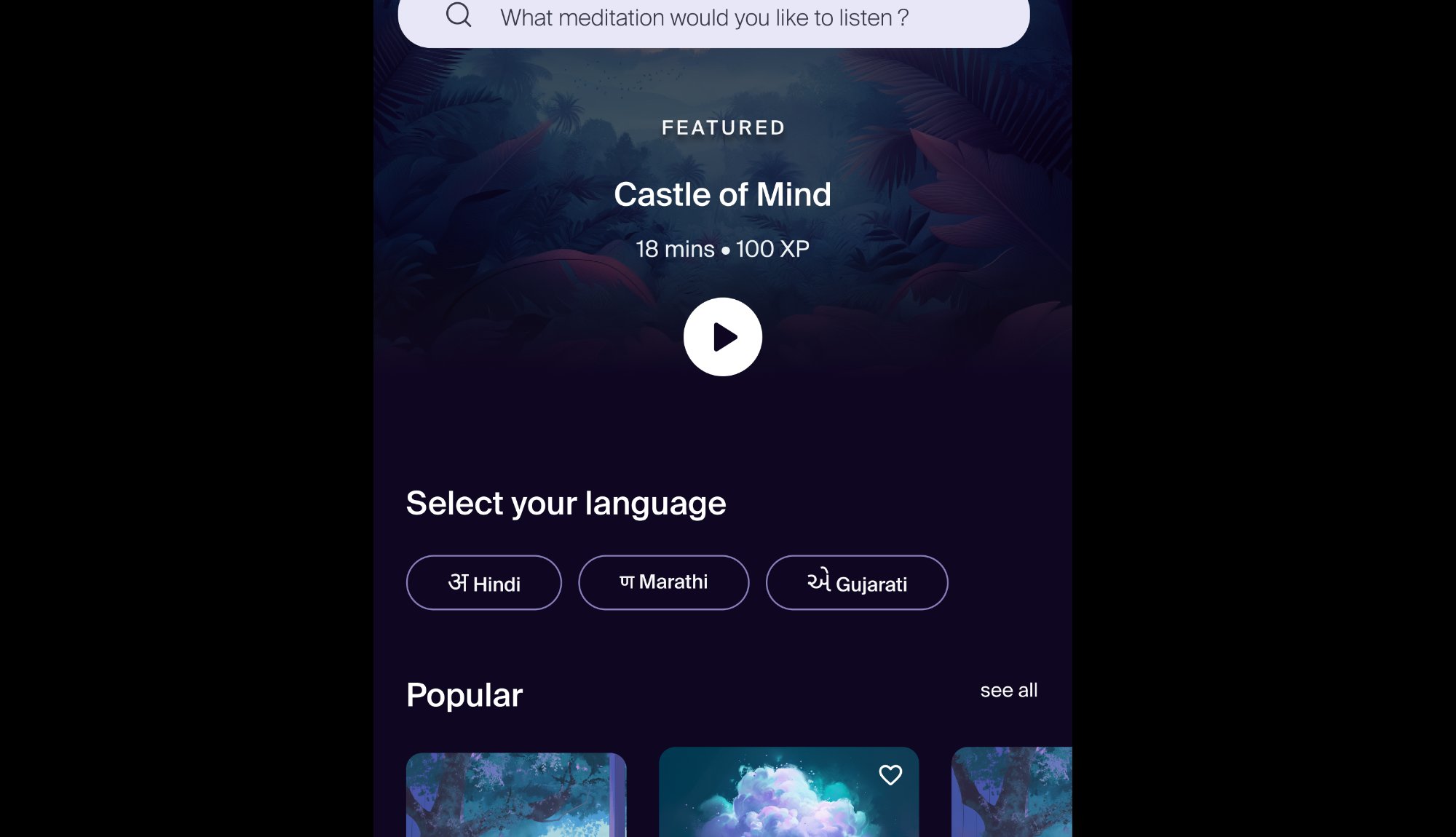
Use multiple tertiary buttons for convenience and control actions — like language selection where options are equal weight.
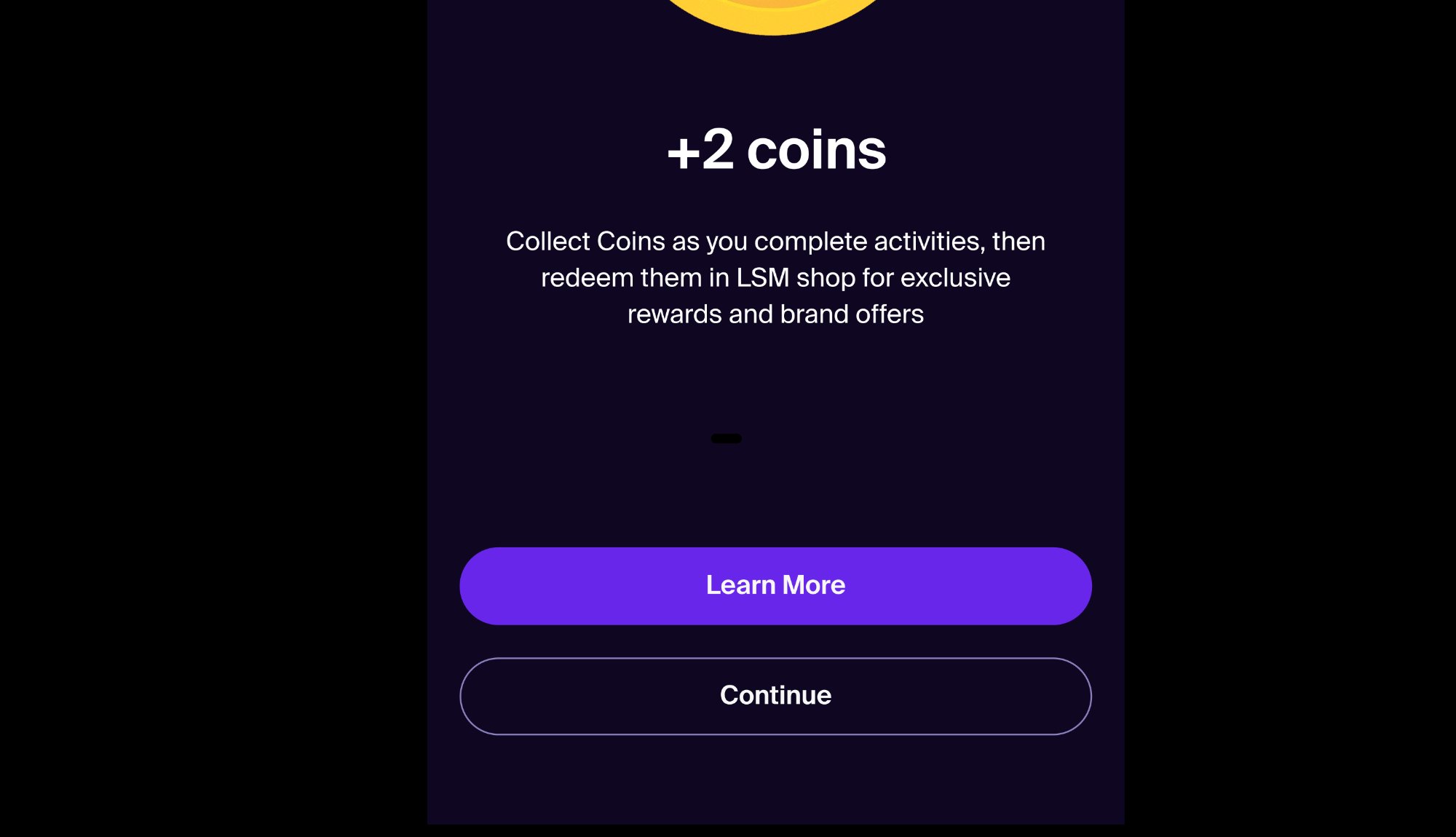
Don't use tertiary for dismissive actions. Use the Minimal button type instead — "Continue" here should be Minimal, not secondary/tertiary.
Use the large button at the bottom of a page or content block to guide the user to the next step.
Don't use large buttons inside cards or list items — use the medium or small size instead.
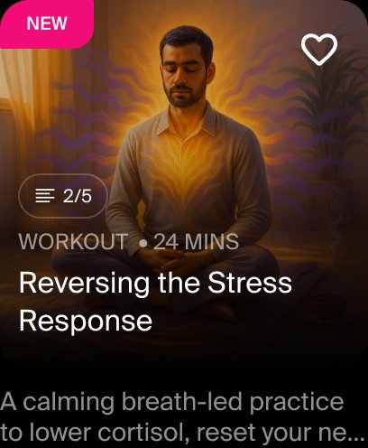
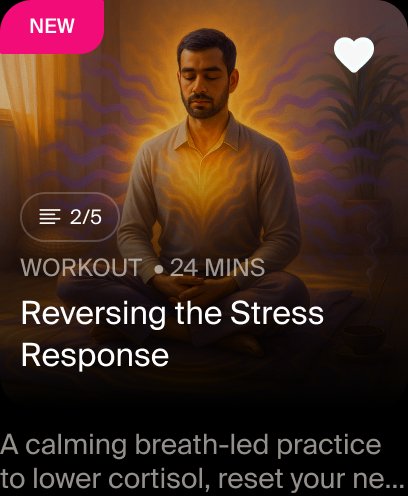
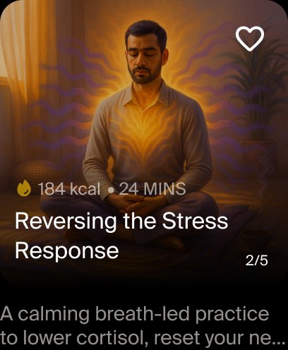
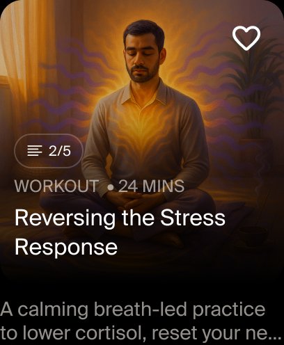
Activity Card
A card component used to display activities throughout the app. Self-contained blocks of content that can be placed next to one another and scroll off screen.
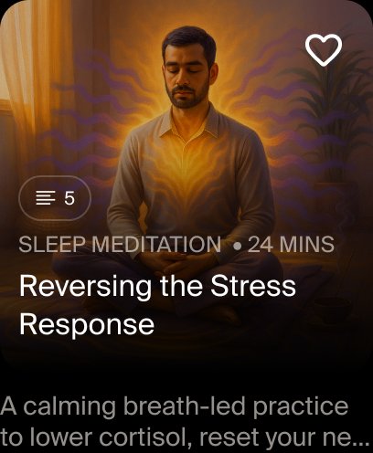
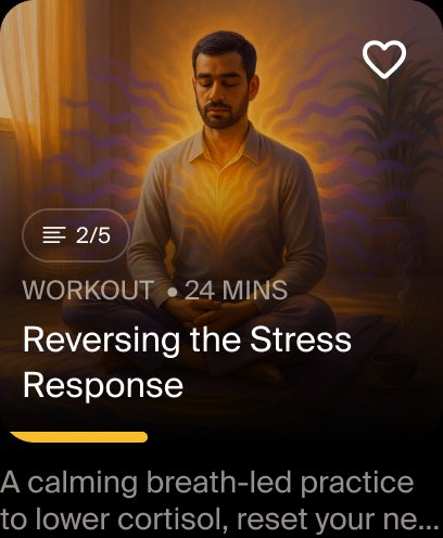
| Element | Text Style | Notes |
|---|---|---|
| Activity Type / Series Tag | Subtitle | 12px Regular, uppercase, LS 0.06 |
| Card Title | Body Large Bold | 16px Semibold |
| Description | Body Regular | 14px Regular, truncated |
Show ☰ icon with series count (e.g. ☰ 5 or ☰ 2/5) to indicate a series or progress in one.
Fill the like icon with #F7F7F7 when an activity is liked by the user.
Don't use the old "Meditation Series" label notation — the series type is now shown via the subtitle tag.
Show calorie icon 🔥 + kcal count for workout cards when calorie data is available.